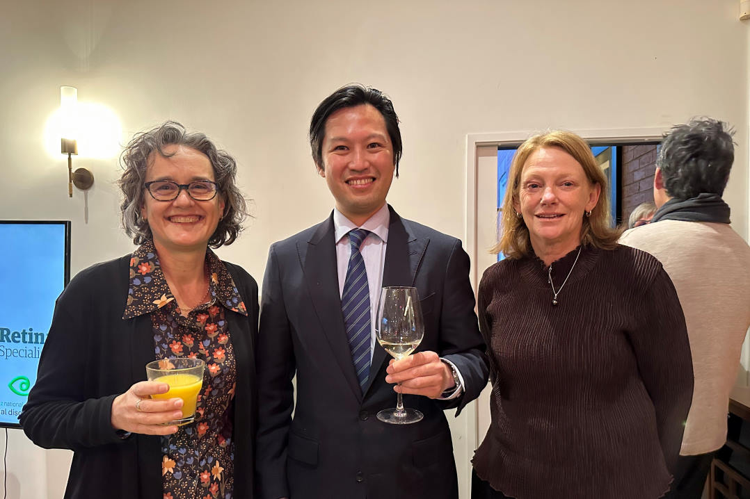


Having helped develop a new set of 10 internationally recognisable and simplified optotypes to improve visual acuity (VA) checks for young children, vision researcher Dr Lisa Hamm admits to being a little fixated by optotype choice. Here she shares that passion with a short guide to the evolution of VA charts.
Humans have a long history of using natural targets to quantify the limits of vision. The number of stars comprising the Matariki cluster reflects something about the limits of resolution (Matariki: The Star of the Year by Rangi Mātāmua is a great book if you’re interested). Natural targets were also key in recognition acuity – the ability to identify who or what is coming towards you from a distant location had substantial functional importance long before the eye chart!
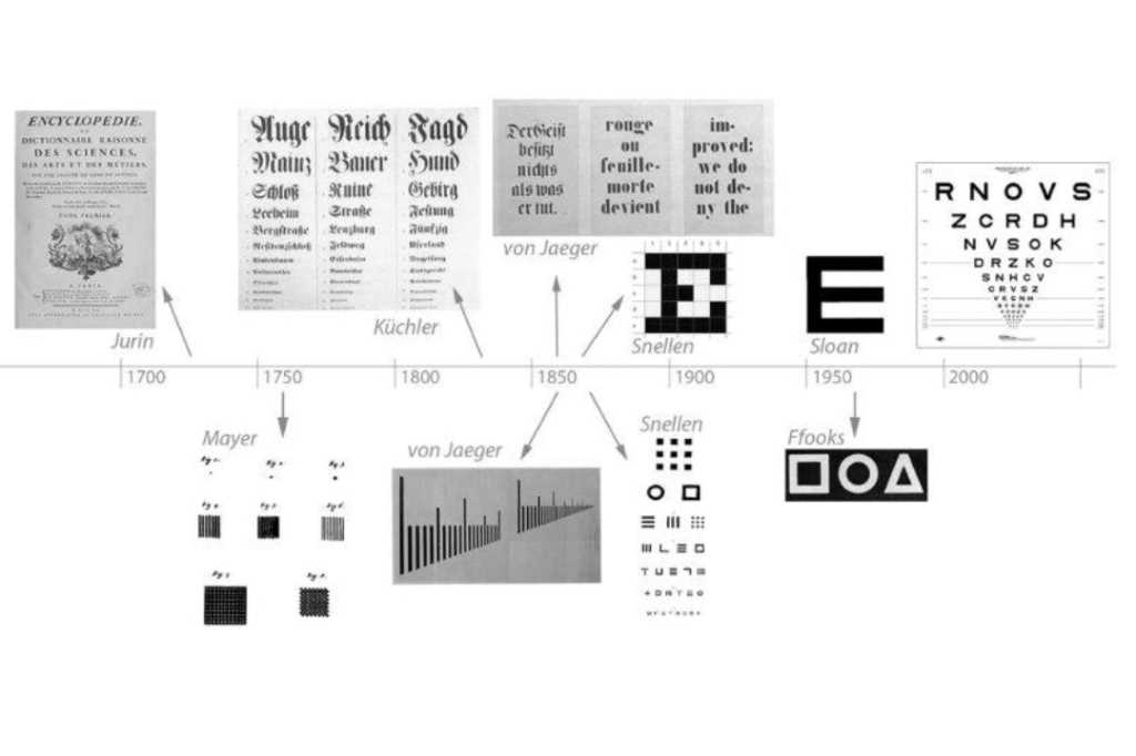
The first documented attempt I’m aware of for standardising this metric was in the early 1700s. James Jurin noted that books printed together but shipped widely (such as encyclopaedias) allowed consistent words, at a range of sizes, to be seen by people living in different places. With viewing distances controlled, the smallest readable word could be compared between locations and used to track changes in people’s ability over time.
German ophthalmologist Heinrich Georg Küchler appeared to be the first to specifically design and promote a recognition acuity chart in 1835. His eye chart included birds, frogs, farm implements and cannons, cut from calendars and almanacs and glued to a sheet of paper in decreasing size. It did not catch on, the flaws reportedly obvious to him as well – the symbols were not uniformly difficult to identify. He gave up on pictures and, like Jurin, shifted to words.
Standardising the design, printing and use of recognition acuity charts ramped up a few decades later with Eduard von Jaeger. He published reading samples in various languages based on available fonts, for measuring near acuity. He compiled meticulous tiny kits which could fit in a shirt pocket to distribute internationally. Alongside his reading charts he included resolution measures based on those used to calibrate microscopes, reportedly preferring the resolution task because of its precision. Clinicians, on the other hand, preferred measures that had clear functional relevance; words remained a staple.
Balancing the relative benefits of functional importance and precision led to a focus on font design. Dutch ophthalmologist Herman Snellen cared about keeping stroke width constant. Rather than reverting to resolution, like Jaeger (and his predecessor Tobias Mayer, 1755), Snellen started specifically designing abstract symbols for recognition where he could control outline thickness. However, he found that it was difficult for patients to describe the symbols (see examples pictured in the history image) so moved towards carefully designed letters. In the 1860s he designed a new font, constrained within a 5x5 grid – what we know today as the Snellen letters. To my knowledge, this is the first custom font specifically designed to test recognition acuity and it changed the way we think about eye charts.
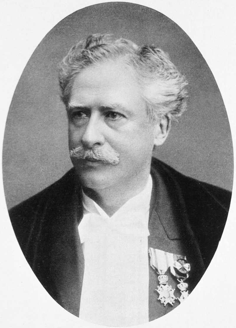
Herman Snellen
Snellen’s charts were hugely popular and widely used from 1863 to 1963. Interestingly, there was an attempt in the late 1860s by Dr John Green to make the letters in this grid format simpler by removing the serifs. However, sans-serifs reportedly looked ‘unfinished’ at the time. It wasn’t until the 1980s that we were ready for the aesthetics of more streamlined letters, when Louise Sloan’s tidy serif-free Sloan Letters gained popularity and the Early Treatment of Diabetic Retinopathy Study (ETDRS) popularised a specific group of 10 Sloan letters.
Optotype examples
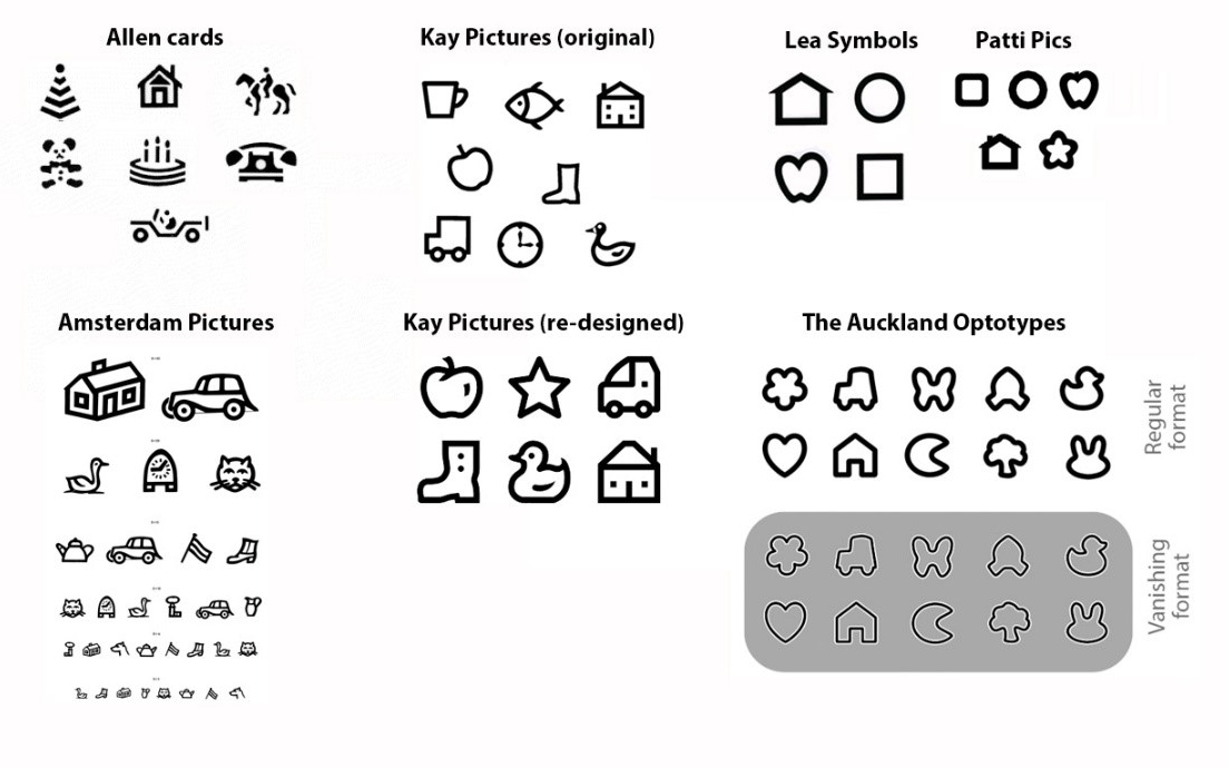
Although standard within a research context and used extensively clinically, this Sloan font group of letters has some downfalls. The letters are not equally legible and Roman letters are not appropriate across cultures. So, the design project continues, including the exploration of non-Roman language symbols and a return to designing picture optotypes. Küchler’s almanac paper craft and Ffooks’ symbols have been followed by a string of eager symbol designers interested in expanding the number of nameable symbols and standardising the design to make optotype sets which are equally legible. Notably, this includes Kay pictures and Lea symbols and, most recently, our own School of Optometry and Vision Science’s (SOVS’) set ‘The Auckland Optotypes’, developed by the head of SOVS Professor Steven Dakin’s lab www.clinicalvision.org and funded by Cure Kids.*
Maximisation of both precision and functional relevance continues to drive innovation in optotype design. Almost every historical figure who really dug into standardising recognition acuity tended towards measures of resolution – Jurin, Küchler, Jaeger and Snellen were all drawn towards lines and dots. This tension remains: resolution tends to resonate with vision scientists, but proves less useful for clinical purposes. We felt this tension when designing optotypes and resolved it partially by including both classic shapes and ‘vanishing’ (a version of the set that disappear into the background when the stroke cannot be resolved), and by being careful about the details. We used consistent stroke widths, continuous lines, no internal features or sharp angles and tried to balance the set, in terms of complexity and how much each shape overlapped with the others.
As someone who enjoys art and science, I loved being part of this process and was pleased with how these design principles made the symbols more equally legible¹. Innovation in this space remains key as we continue to learn more, so we’ve made these optotypes freely available to researchers to use and critique and we’re excited to see where the field goes in the future.
*For more on The Auckland Optotypes see: https://eyeonoptics.co.nz/articles/archive/children-s-eye-chart-upgraded/
References
Dr Lisa Hamm is a research fellow at the School of Optometry and Vision Science at the University of Auckland.